Apple, design, Font Book, icon design, graphic design, Liquid Glass, user interface, designer community, visual identity
## Introduction
In the world of graphic design, icons serve as the silent ambassadors of functionality, guiding users through digital experiences while encapsulating a brand's identity. Apple, a company renowned for its aesthetic sensibilities and user-friendly interface, has recently unveiled a new Font Book icon that has left many designers feeling bewildered and discontented. The shift from a classic design to one that embodies a "Liquid Glass" effect has sparked considerable debate within the designer community. This article will explore the implications of this design change, the reactions it has garnered, and what it means for the future of iconography in digital design.
## The Design Community's Reaction
### A Shift in Aesthetic Values
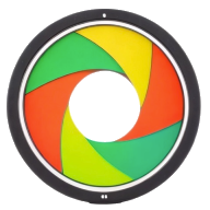
The announcement of the new Font Book icon has not gone unnoticed among designers. Traditionally, the Font Book icon featured a straightforward and recognizable book design, which resonated with its function—providing users with access to their font library. The new icon, however, embodies a sleek, modernized “Liquid Glass” aesthetic, characterized by fluid shapes and a glossy finish. While some may appreciate the contemporary look, many in the design community argue that this shift prioritizes style over functionality.
### Critiques of the Liquid Glass Effect
Critics have raised concerns that the Liquid Glass design may obscure the icon's intended function. Icons need to convey their purpose at a glance, and the new Font Book icon, with its reflective and somewhat elusive surface, risks losing that clarity. Designers argue that the shift away from a more traditional representation may confuse users, particularly those less familiar with the nuances of graphic design. The essence of an icon is to communicate effectively, and when that communication becomes muddled, it detracts from the user experience.
## The Impact on Iconography in Digital Design
### A Broader Trend: Form Over Function?
The Font Book icon controversy is indicative of a larger trend in digital design where aesthetics often take precedence over usability. As technology evolves, there is a palpable shift towards minimalist designs and abstract representations. While these trends can breathe new life into digital interfaces, they also raise fundamental questions about the balance between visual appeal and user accessibility.
### The Role of Iconography in User Interface Design
Iconography plays a pivotal role in user interface design, serving as visual shorthand that enables users to navigate complex software with ease. Effective icons are not merely decorative; they must be intuitive and informative. Designers often draw upon established visual language to ensure that users can immediately grasp the function of an icon without extensive instruction. The debate surrounding the Font Book icon reflects a struggle between innovation in design and the need to maintain clarity and user-friendliness.
## The Future of Icon Design: Navigating the Tension Between Innovation and Tradition
As the discussion around the Font Book icon unfolds, it begs the question: what does the future hold for icon design? The tension between innovation and tradition is likely to shape the trajectory of design practices in the coming years.
### Embracing a Hybrid Approach
In an era where user experience is paramount, a possible solution lies in embracing a hybrid approach to icon design. By blending contemporary design techniques, such as the Liquid Glass effect, with recognizable forms, designers can create icons that are both visually appealing and functionally effective. This approach could help bridge the gap between modern aesthetics and traditional clarity, ensuring that icons remain intuitive while also evolving with current design trends.
### Engaging with the Designer Community
Another crucial aspect of navigating this tension is engaging with the designer community. As the Font Book icon controversy illustrates, designers have strong opinions about the aesthetics and functionality of icons. Actively seeking feedback during the design process can result in more thoughtful, user-centered outcomes. By fostering an open dialogue between designers, users, and developers, companies like Apple can create icons that resonate with their audience while pushing the boundaries of design.
## Conclusion
The unveiling of Apple's new Font Book icon has ignited a passionate discussion among designers about the balance between aesthetics and functionality in icon design. While the Liquid Glass effect may appeal to some, it has raised valid concerns about usability and clarity in digital interfaces. As the design landscape continues to evolve, it is crucial for designers to remain vigilant about maintaining the integrity of visual communication. Engaging with the designer community and embracing innovative yet user-friendly design practices will be essential in shaping the future of iconography. Ultimately, the challenge lies in crafting icons that not only reflect the zeitgeist of contemporary design but also serve their core purpose: to guide users seamlessly through their digital experiences.
Source: https://www.creativebloq.com/design/logos-icons/apples-new-font-book-icon-is-upsetting-designers