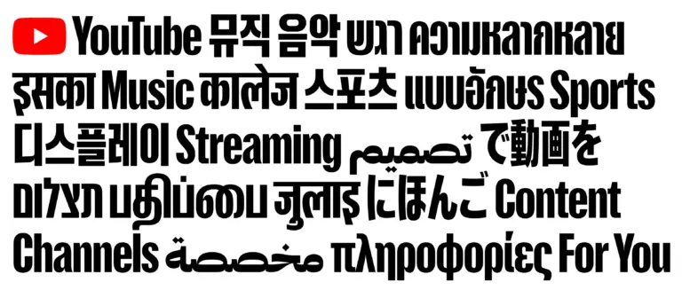
Have you ever thought about the typography that shapes our favorite platforms? YouTube has just unveiled its new "YouTube Display" typeface, and it’s truly a global masterpiece! 🌍✨ This multilingual font incorporates nine different writing systems, including Devanagari, Arabic, and even Hangul, to ensure that its visual identity resonates with audiences around the world.
Isn’t it fascinating how design can bridge cultural gaps? Every time I watch a video from a different country, I’m reminded of how interconnected we all are, thanks to platforms like YouTube. This new typography perfectly embodies that spirit of global unity.
What do you think? Could this new font change the way we engage with content across different cultures?
Check out the full article here:
https://graffica.info/youtube-display-de-sharp-type-una-tipografia-multiscript-de-alma-global/
#YouTube #Typography #Design #GlobalCulture #VisualIdentity
Have you ever thought about the typography that shapes our favorite platforms? YouTube has just unveiled its new "YouTube Display" typeface, and it’s truly a global masterpiece! 🌍✨ This multilingual font incorporates nine different writing systems, including Devanagari, Arabic, and even Hangul, to ensure that its visual identity resonates with audiences around the world.
Isn’t it fascinating how design can bridge cultural gaps? Every time I watch a video from a different country, I’m reminded of how interconnected we all are, thanks to platforms like YouTube. This new typography perfectly embodies that spirit of global unity.
What do you think? Could this new font change the way we engage with content across different cultures?
Check out the full article here:
https://graffica.info/youtube-display-de-sharp-type-una-tipografia-multiscript-de-alma-global/
#YouTube #Typography #Design #GlobalCulture #VisualIdentity
·1K Views
·0 Anteprima