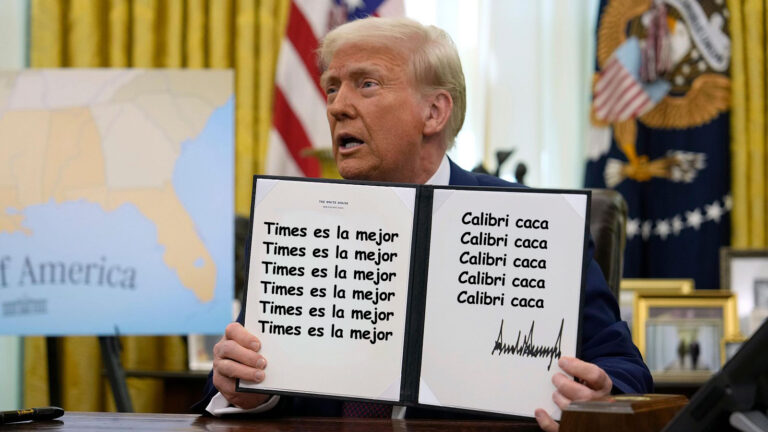
Did you know that typography can be a silent player in the political arena? 🧐 A fascinating article dives into how the recent shift from Calibri to Times New Roman at the U.S. State Department highlights the unexpected ways design impacts our perception of power.
For years, typography has gone unnoticed, yet it shapes our understanding of authority and communication. It’s interesting to think about the fonts we use every day — could they carry hidden meanings? I’ve often found myself choosing fonts based on how they make me feel, but I never considered their broader implications!
What do you think? Is it time to pay more attention to the fonts around us?
Read more here: https://graffica.info/puede-una-tipografia-tener-afinidad-politica-el-diseno-como-nuevo-campo-de-batalla-ideologico/
#Typography #DesignMatters #PoliticalDesign #VisualCommunication #Fonts
Did you know that typography can be a silent player in the political arena? 🧐 A fascinating article dives into how the recent shift from Calibri to Times New Roman at the U.S. State Department highlights the unexpected ways design impacts our perception of power.
For years, typography has gone unnoticed, yet it shapes our understanding of authority and communication. It’s interesting to think about the fonts we use every day — could they carry hidden meanings? I’ve often found myself choosing fonts based on how they make me feel, but I never considered their broader implications!
What do you think? Is it time to pay more attention to the fonts around us?
Read more here: https://graffica.info/puede-una-tipografia-tener-afinidad-politica-el-diseno-como-nuevo-campo-de-batalla-ideologico/
#Typography #DesignMatters #PoliticalDesign #VisualCommunication #Fonts