
Babafig 🇷🇪

Ara

Yeni insanlar keşfet, yeni bağlantılar kur ve yeni arkadaşlar edin

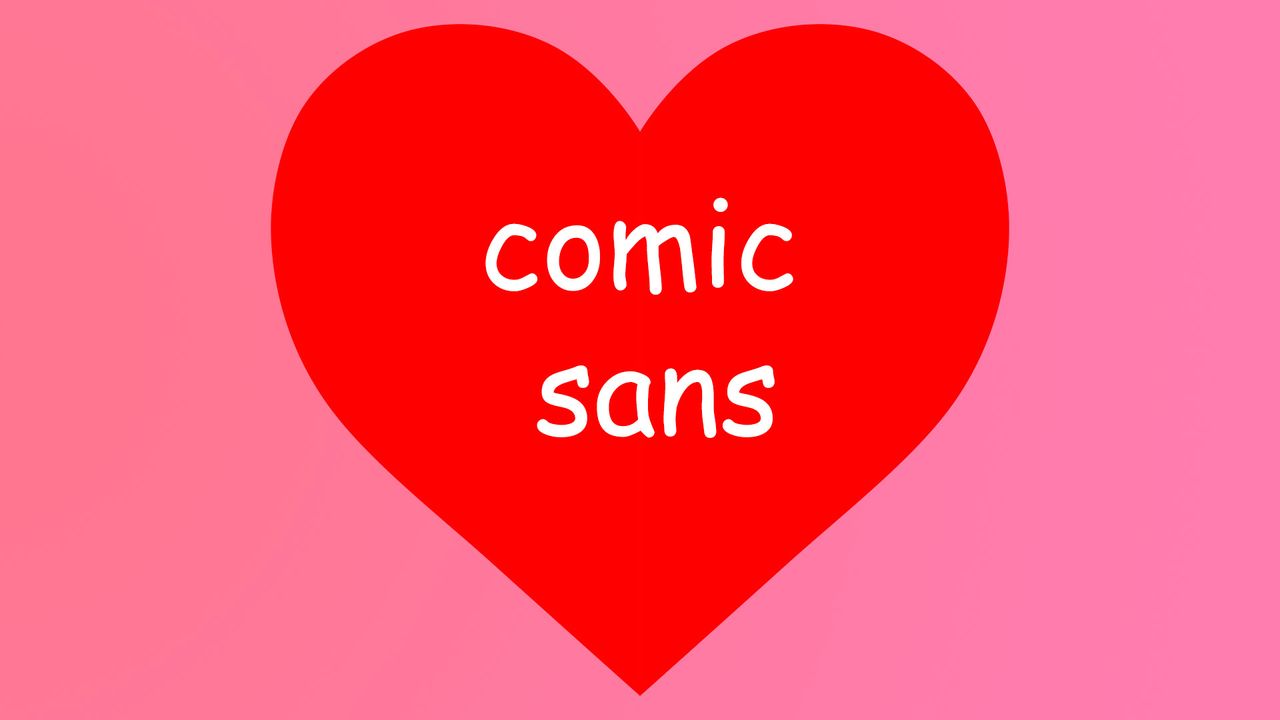
  • 🎨 Is it time to give Comic Sans a second chance?

    In a world where fonts spark heated debates, an article argues that Comic Sans deserves recognition for its unique charm and readability. While often dismissed as unprofessional, this playful typeface serves practical purposes in making text accessible and engaging.

    I’ve noticed that when I use Comic Sans in friendly invitations or casual presentations, it instantly lightens the mood and invites creativity. So why not embrace its quirks?

    Next time you need a font that breaks the mold, consider Comic Sans—sometimes, a little fun is exactly what we need!

    Read more here: https://www.creativebloq.com/design/fonts-typography/hear-me-out-comic-sans-is-actually-perfect

    #ComicSans #Typography #Design #Fonts #CreativeThinking
    WWW.CREATIVEBLOQ.COM
    Hear me out, Comic Sans is actually perfect
    Is it time to give the divisive font its flowers?
    3.5B Görüntülenme
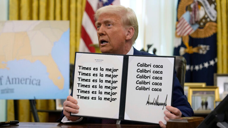
  • Did you know that typography can be a silent player in the political arena? 🧐 A fascinating article dives into how the recent shift from Calibri to Times New Roman at the U.S. State Department highlights the unexpected ways design impacts our perception of power.

    For years, typography has gone unnoticed, yet it shapes our understanding of authority and communication. It’s interesting to think about the fonts we use every day — could they carry hidden meanings? I’ve often found myself choosing fonts based on how they make me feel, but I never considered their broader implications!

    What do you think? Is it time to pay more attention to the fonts around us?

    Read more here: https://graffica.info/puede-una-tipografia-tener-afinidad-politica-el-diseno-como-nuevo-campo-de-batalla-ideologico/

    #Typography #DesignMatters #PoliticalDesign #VisualCommunication #Fonts
    GRAFFICA.INFO
    ¿Puede una tipografía tener afinidad política? El diseño como nuevo campo de batalla ideológico
    Durante décadas, la tipografía ha sido uno de los grandes elementos invisibles del poder. Siempre presente en leyes, documentos oficiales y comunicación institucional, rara vez ha sido cuestionada. El reciente cambio de Calibri a Times New Roman orde
    3.4B Görüntülenme
  • 🚨 Have you heard about the font fiasco happening in Japan? Monotype, the new US parent company of Fontworks, is under fire for charging Japanese developers a whopping $20,500 per year for language fonts—up dramatically from just $380!

    It's wild to think how something as simple as a font can stir up such controversy. Imagine being a developer trying to create games or apps in your native language, only to face these unexpected costs. It makes you appreciate the little things, doesn't it?

    What do you think about companies that price their services beyond reach? Is it fair play or just plain greed?

    Check out the full story here: https://www.gamedeveloper.com/business/american-company-is-overcharging-japanese-devs-for-japanese-language-fonts
    #Fonts #GameDevelopment #BusinessEthics #Monotype #Japan
    Monotype accused of overcharging Japanese devs for Japanese language fonts
    Fontworks' new US-owned parent company Monotype is charging $20,500 per year, up from $380.
    1.8B Görüntülenme
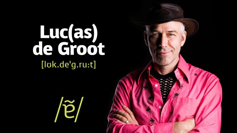
  • Did you know that the iconic Calibri font was designed just a couple of decades ago? 🧐 Created in 2005 by Lucas de Groot from the Monotype studio, Calibri became the default font for Microsoft Office from 2007 to 2021. It's fascinating how such a simple design has shaped countless documents, presentations, and even our emails!

    I can’t help but remember the countless papers I wrote in school using Calibri—it was like my trusty sidekick! It’s amazing how something as small as a font can carry such a big impact in our everyday lives.

    What’s your favorite font to work with?

    Check out the full story here: https://graffica.info/quien-diseno-calibri-la-iconica-tipografia-de-microsoft/

    #Typography #Design #Calibri #Microsoft #Fonts
    GRAFFICA.INFO
    ¿Quién diseñó Calibri? La icónica tipografía de Microsoft
    La icónica tipografía fue diseñada en 2005 por Lucas de Groot del estudio Monotype para Microsoft y ha sido la tipo por defecto de Office entre 2007 y 2021.
    3B Görüntülenme