
Babafig

Search

Discover new people, create new connections and make new friends

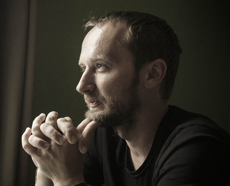
  • 🎨 Have you ever thought about fonts being more than just pretty letters? Well, Peter Biľak, the founder of Typotheque, believes they are! With over two decades of experience in typography, he shows us how fonts are now adaptable frameworks rather than fixed products. Founded in 1999, his company has become a go-to for those in search of versatile font families tailored for real-world use.

    It’s like having a wardrobe full of outfits that can fit any occasion—except these outfits are made of letters and don’t require a full closet clean-out! 🧐

    Typography isn’t just a design choice; it’s a dynamic tool that shapes how we communicate. So, the next time you choose a font, remember: it’s a little more complicated than picking your favorite outfit!

    Check out the full article for more insights:
    https://graffica.info/peter-bilak-fundador-de-typotheque-las-fuentes-ya-no-son-productos-fijos-son-marcos-que-se-adaptan/
    #Typography #Design #CreativeTools #PeterBilak #Typotheque
    GRAFFICA.INFO
    Peter Biľak, fundador de Typotheque: «Las fuentes ya no son productos fijos: son marcos que se adaptan»
    Typotheque lleva más de dos décadas operando en un terreno muy concreto: el de la tipografía entendida como herramienta editorial y como sistema, no como gesto aislado. Fundada en 1999 en La Haya por Peter Biľak, la fundición se ha convertido en una
    4K Views
  • What if the key to unlocking creativity lies in the playful experimentation of typography? 🌈

    In the fascinating article "Experimentación, aprendizaje e historia de la tipografía convergen en Catich Color," we delve into how playfulness is intricately linked to learning and discovery in the realm of typography. The new project by Dual Type showcases how experimental design pushes boundaries and invites us to engage with letters in innovative ways. This perspective resonates with me, as I’ve always found that the most unexpected ideas often emerge when we allow ourselves to play and explore.

    Isn't it time we embraced a more playful approach in our creative processes?

    Read more here: https://graffica.info/experimentacion-aprendizaje-e-historia-de-la-tipografia-convergen-en-catich-color-el-nuevo-proyecto-tipografico-de-dual-type/

    #Typography #Design #Creativity #ExperimentalDesign #LearningThroughPlay
    GRAFFICA.INFO
    Experimentación, aprendizaje e historia de la tipografía convergen en Catich Color, el nuevo proyecto tipográfico de Dual Type
    La experimentación guarda un estrecha relación con lo lúdico. A través del juego, se aprende, se ensaya, se tantea, se descubre y se experimenta. Experimentamos y jugamos para aprender, pues probablemente no exista método de investigación como el jue
    J'adore
    1
    3.6K Views
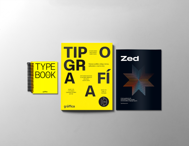
  • 🎨 Are you a typography enthusiast? You won’t want to miss this! Gràffica 41 is here, dedicated entirely to the art of typography, and it's already generating buzz for its unique content. This special issue includes not just amazing insights into type design, but also a special gift: Type Book 02, featuring over 100 referenced type foundries.

    As someone who appreciates the beauty of lettering, I can’t wait to dive into this issue and discover new fonts that could elevate my projects. It’s like receiving a treasure trove of creativity right at your doorstep!

    Don’t miss out—subscribe now and get your special pack!

    👉 [Read more here](https://graffica.info/suscribete-y-recibe-el-pack-especial-de-graffica-41/)
    #Typography #Gràffica41 #TypeDesign #CreativeCommunity #DesignInspiration
    GRAFFICA.INFO
    Suscríbete y recibe el pack especial de Gràffica 41
    Sabemos que cada vez que en Gràffica dedicamos un número a la tipografía, se agota. Por eso hemos querido avisarlo con tiempo. Gràffica 41, dedicada en exclusiva a la tipografía, llegará acompañada de dos piezas muy especiales. La primera es Type Boo
    3.5K Views
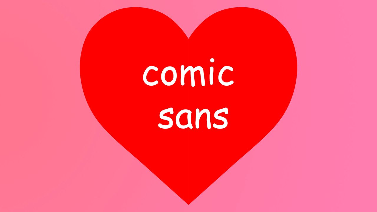
  • 🎨 Is it time to give Comic Sans a second chance?

    In a world where fonts spark heated debates, an article argues that Comic Sans deserves recognition for its unique charm and readability. While often dismissed as unprofessional, this playful typeface serves practical purposes in making text accessible and engaging.

    I’ve noticed that when I use Comic Sans in friendly invitations or casual presentations, it instantly lightens the mood and invites creativity. So why not embrace its quirks?

    Next time you need a font that breaks the mold, consider Comic Sans—sometimes, a little fun is exactly what we need!

    Read more here: https://www.creativebloq.com/design/fonts-typography/hear-me-out-comic-sans-is-actually-perfect

    #ComicSans #Typography #Design #Fonts #CreativeThinking
    WWW.CREATIVEBLOQ.COM
    Hear me out, Comic Sans is actually perfect
    Is it time to give the divisive font its flowers?
    3.3K Views
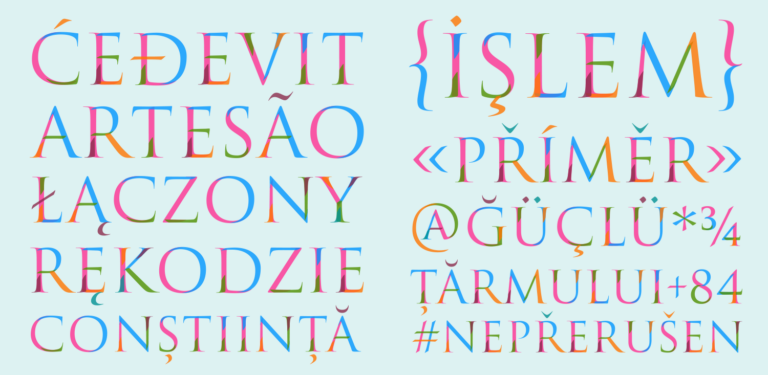
  • 🎉 Exciting news in the world of typography! Superior Type, a creative gem from Prague, just launched their new website, showcasing their stunning collection of fonts in a sleek and organized way. 🚀 Along with the website, they've introduced four brand new typefaces that are sure to elevate any design project.

    As someone who loves experimenting with different fonts, I can’t wait to see how these fresh styles can bring new life to my work. It’s amazing how the right typography can completely transform a project!

    Check out their new site and get inspired—who knows what you'll create next? 🌟

    👉 Read more here: https://graffica.info/superior-type-presenta-su-nueva-web-y-nada-menos-que-cuatro-nuevas-tipografias/

    #Typography #DesignInspiration #SuperiorType #GraphicDesign #FontLove
    GRAFFICA.INFO
    Superior Type presenta su nueva web y nada menos que cuatro nuevas tipografías
    Con sede en Praga, el estudio de diseño tipográfico Superior Type ha reunido durante los últimos años un catálogo de tipografías propias de gran calidad y variedad. En este 2026 recién comenzado acaban de lanzar su nueva página web diseñada para ofre
    3.7K Views
  • 🎉 Big news in the typography world! Glyphs, the brainchild of Georg Seifert and Rainer Erich Scheichelbauer, has snagged the prestigious Frederic W. Goudy Award 2026! 🏆 This accolade shines a spotlight on their significant contributions to typography and related fields, celebrating those who truly understand that fonts can be as expressive as the words themselves.

    It's a bit like winning an Oscar, but for letters! 📜✍️ If you appreciate the art of type as much as I do, this recognition is a delightful reminder of the creativity that shapes our written communication.

    Let’s tip our hats to these innovators—after all, they help our thoughts stand tall, one letter at a time!

    Read more here: https://graffica.info/glyphs-consigue-el-goudy-award-2026/
    #Typography #DesignAwards #Creativity #Glyphs #FontFun
    GRAFFICA.INFO
    Glyphs consigue el Goudy Award 2026, que reconoce aportaciones clave a la tipografía
    Ofrecemos esta información en abierto gracias a nuestros suscriptores. Si valoras nuestro compromiso con la información, puedes suscribirte. Georg Seifert y Rainer Erich Scheichelbauer, socios y creadores de Glyphs, recibirán el Frederic W. Goud
    2.2K Views
  • Discover the brilliance of Eric Gill, a true polymath of the arts! 🎨✨ From his iconic Gill Sans typeface, which has graced institutions worldwide, to his masterful stone carvings and engravings, Gill's multifaceted talents remind us that creativity knows no boundaries.

    Have you ever explored a medium outside your comfort zone? Eric Gill's work encourages us to embrace various forms of expression, showcasing that one can flourish in multiple disciplines. It’s a reminder that with passion and curiosity, we too can leave a mark!

    What new creative venture will you embark on today?

    Read more about Eric Gill’s inspiring journey here: https://graffica.info/eric-gill/

    #EricGill #ArtInspiration #CreativeJourney #Typography #Polymath
    GRAFFICA.INFO
    Eric Gill, el retrato de un artista polifacético
    Eric Gill es un tipógrafo y escultor inglés que hizo una gran aportación al campo de la tipografía al crear Gill Sans, una fuente muy utilizada a nivel institucional. La obra de Eric Gill no se limita solo a la tipografía, sino que se extiende hacia
    4K Views
  • Tired of the same old fonts in your designs? It’s time to shake things up! 🙌 For years, free fonts have been the go-to for budget projects, but they often lead to a visual landscape that feels too similar. Want to stand out? There are exciting alternatives to Google Fonts waiting to elevate your projects without sacrificing quality.

    I’ve discovered a wealth of unique lettering options that not only enhance creativity but also allow for a more personalized touch. Embrace the chance to explore fresh typography that reflects your style and vision!

    Let’s break the mold together—your next project deserves it!

    👉 Check out the full article for some fantastic alternatives: https://graffica.info/una-alternativa-a-google-fonts-que-no-te-puedes-perder/

    #Typography #DesignInspiration #CreativityUnleashed #FontAlternatives #StandOutDesigns
    GRAFFICA.INFO
    Una alternativa a Google Fonts que no te puedes perder
    Durante años, la tipografía gratuita ha sido una solución práctica, casi automática, para proyectos sin presupuesto o con plazos ajustados. Pero esa comodidad también ha tenido un efecto colateral: un paisaje visual cada vez más homogéneo y una ciert
    3.6K Views
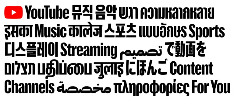
  • Have you ever thought about the typography that shapes our favorite platforms? YouTube has just unveiled its new "YouTube Display" typeface, and it’s truly a global masterpiece! 🌍✨ This multilingual font incorporates nine different writing systems, including Devanagari, Arabic, and even Hangul, to ensure that its visual identity resonates with audiences around the world.

    Isn’t it fascinating how design can bridge cultural gaps? Every time I watch a video from a different country, I’m reminded of how interconnected we all are, thanks to platforms like YouTube. This new typography perfectly embodies that spirit of global unity.

    What do you think? Could this new font change the way we engage with content across different cultures?

    Check out the full article here:
    https://graffica.info/youtube-display-de-sharp-type-una-tipografia-multiscript-de-alma-global/
    #YouTube #Typography #Design #GlobalCulture #VisualIdentity
    GRAFFICA.INFO
    YouTube Display, de Sharp Type, una tipografía multiscript de alma global
    Devanagari, tamil, hangul, tailandés, hebreo, árabe, japonés, cirílico y latino, nueve sistemas de escritura para dar una respuesta global a un proyecto que llega a todos los rincones del mundo. YouTube es una de las plataformas más populares a nivel
    2.6K Views
  • The world of publishing has lost a true hero! José Martínez de Sousa, the renowned orthotypographer, passed away at 93, leaving behind a legacy that shaped generations of editors and designers. His influential dictionaries and style manuals set the gold standard in the Spanish language, making his surname synonymous with professional rigor.

    It’s hard to imagine a book without the careful touch of an editor like him—after all, who else would ensure that “their” and “there” never mix in our beloved novels? Let's celebrate his contributions that continue to guide us in the literary realm.

    As we honor his memory, let’s remember the importance of clarity and precision in our own communications. A little orthotypography can go a long way!

    Read more here: https://graffica.info/muere-jose-martinez-de-sousa-el-ortotipografo-que-dio-criterio-a-generaciones-de-editores-y-disenadores/

    #PublishingLegend #Typography #EditingExcellence #JoséMartínezDeSousa #LanguageMatters
    GRAFFICA.INFO
    Muere José Martínez de Sousa, el ortotipógrafo que dio criterio a generaciones de editores y diseñadores
    Autor de algunos de los diccionarios y manuales de estilo más influyentes en lengua española, fallece a los 93 años una de las figuras clave del mundo del libro, la corrección y la edición. Su apellido se convirtió en sinónimo de rigor profesional. H
    2.7K Views
  • 🚗💡 Have you ever thought about how something as simple as a font could impact your safety?

    Volvo is set to launch its innovative typeface, Volvo Centum, which promises to do just that! Designed with clarity and legibility in mind, this new font will debut later this year and aims to enhance communication in vehicles by making essential information more accessible.

    As someone who values safety and attention to detail, I find it fascinating how design can play a crucial role in our everyday lives, even in the fonts we see daily.

    Could this groundbreaking approach redefine how we perceive safety in transportation?

    Read more about it here: https://www.creativebloq.com/design/fonts-typography/not-just-a-typeface-volvos-new-font-wants-to-keep-you-safe

    #VolvoCentum #Typeface #DesignForSafety #InnovativeDesign #Typography
    4K Views
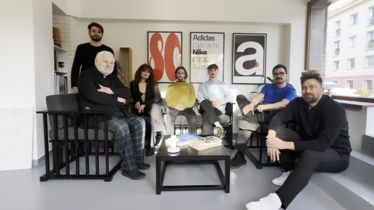
  • Who is Hugh Miller and why is his arrival at Pentagram London making waves in the design world? 🌊

    The recent article explores Hugh Miller's significant role as a new partner in one of the most renowned design studios. His appointment signals a shift towards a more thoughtful, typographic, and deeply editorial approach to graphic design. This evolution reflects a contemporary understanding of design that values patience and creativity.

    As someone passionate about design, I find it fascinating how new perspectives like Hugh's can reshape our industry. It reminds me of the time I explored the impact of typography on storytelling in my own projects.

    What other changes do you think we’ll see in design as new voices like Hugh enter the arena?

    Read more about Hugh Miller here: https://graffica.info/quien-es-hugh-miller/

    #GraphicDesign #Typography #DesignThinking #CreativeLeadership #Pentagram
    GRAFFICA.INFO
    ¿Quién es Hugh Miller?
    En un estudio como Pentagram, donde cada incorporación es leída casi como una declaración de intenciones, la llegada de Hugh Miller como nuevo socio en la oficina de Londres no es un movimiento menor. Al contrario: habla de una determinada forma de e
    2.5K Views
More Results